Get a quote
How Important Is Design And Font For Commercial Wraps?
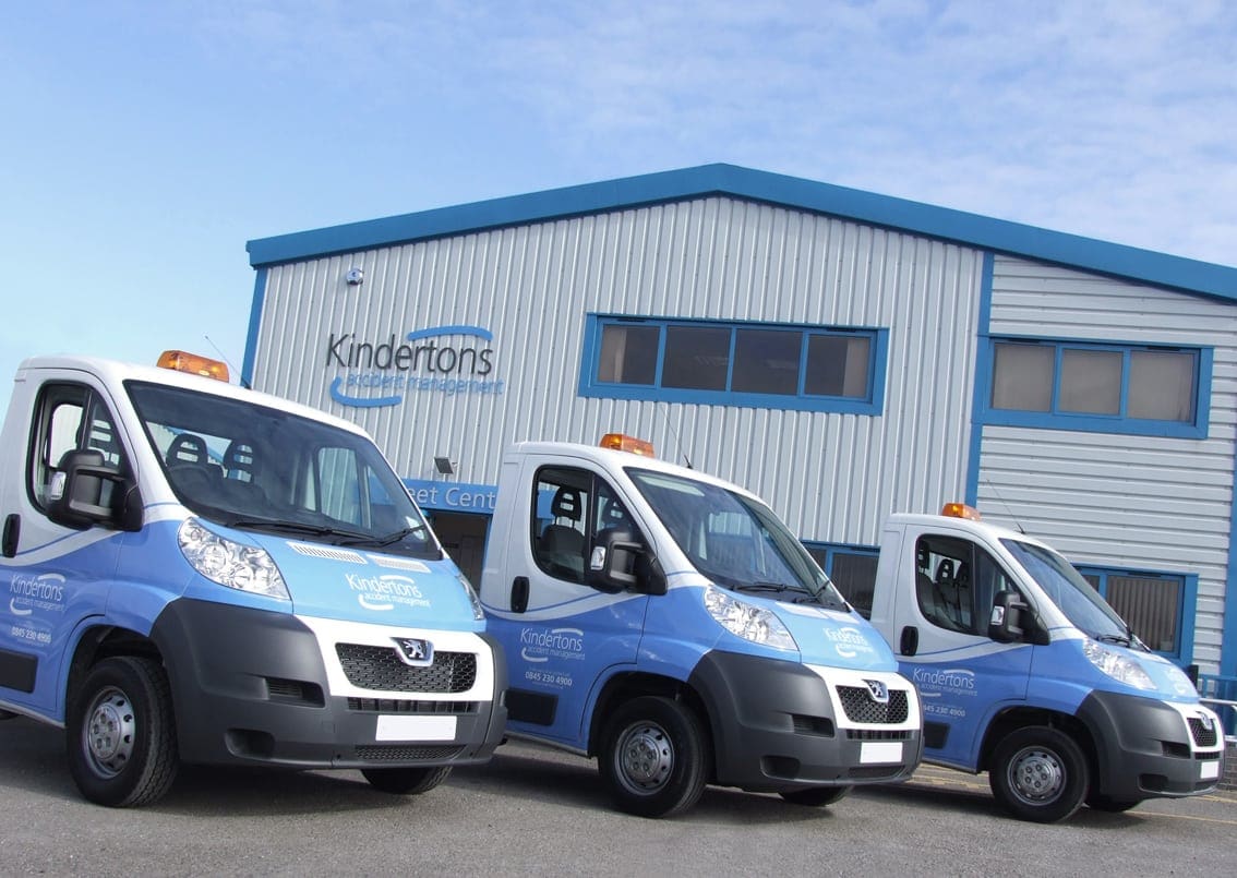
Wrapping your vehicle to advertise your brand is one of the best decisions you can make. That is because commercial wraps offer your business an opportunity to showcase your service. You can make an impact each time your vehicle goes out on the road.
When getting a commercial wrap, two factors play an integral role in your marketing impact. These factors are design and font. If you even get one of them wrong, your advertising is most likely to fail.
Here is everything you need to know about the importance of design and font for commercial wrapping.
Importance Of Design
The design of your vehicle will be your make or break factor. That is because it determines the impact on the audience. So if you don’t have an attention-grabbing design, then your marketing will be ineffective.
Here are some factors that will help you accomplish the best advertising design:
- Colours
The colour of your wrap is one of the most crucial factors to take into account. It is best not to choose vibrant colours. That is because they can act as an eyesore and reduce the impact of printing.
Besides that, keep in mind that people will be looking at a moving vehicle most of the time. So if the colours are too bright, they can give the other person a headache. Additionally, the design colour should complement the colour of the font, or people won’t be able to read it clearly.
- Amount Of Text
The best way to have an impact by commercial wraps is to go for a minimal design with less text. You should only apply the vehicle’s relevant information, such as brand name, logo, and phone number. That is because people will only see the moving vehicle for a few seconds.
If you put too much reading material on the vehicle, the audience may not be able to grasp all of them. Not only that, but they may waste time reading unnecessary information and miss out on the relevant text.
Importance Of Font
People seeing your commercial wrap must be able to read it. Otherwise, there would be no point in getting the wrap. Here are the top things that will help you perfect this aspect:
- Clear Font
Whatever text you print on the vehicle, people must be able to read it. Thus, you should go for modern yet simple fonts. For example, sans serif is the best for advertising due to thin lines and easy letter discernibility.
On the other hand, a graffiti font is one of the worst ideas. Sure it may look cool and very appealing. But for the audience, it will be the opposite. That is because graffiti writing is hard to understand.
- Colour
As we mentioned earlier that it is pertinent your font complements the background colour. Otherwise, it will be tough for people to distinguish the writing. For example, red writing on a black background is quite difficult to read.
Final Words
That was all you needed to learn about the importance of design and font for wraps. If you want the perfect wrapping for advertising, be sure to contact Bossdog. We have the best experts to construct the most suitable and attention-grabbing design for your brand.
What our customers say

Boss Dog have now fitted livery to the vans at all three of our Southern Depots. Throughout the job I have found them happy to advise, efficient and above all professional in their approach. My only regret is that they don't have a branch in the North to service the other half of our fleet.I look forward to using them again as more vehicles come online.
Neil Barlow, Head of Creative, Kindertons Creative
Copyright BossDog | web design
by Brandtastic


